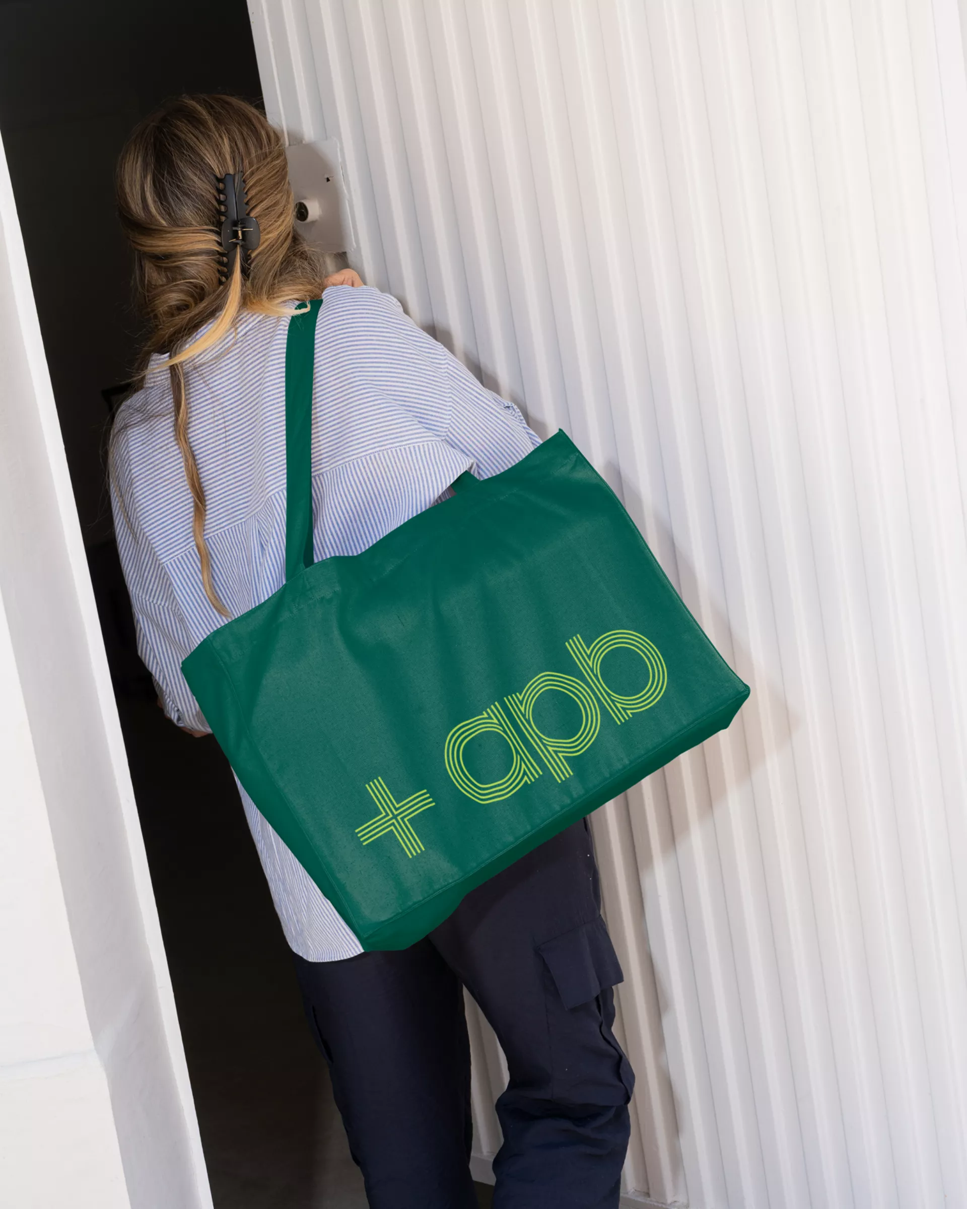
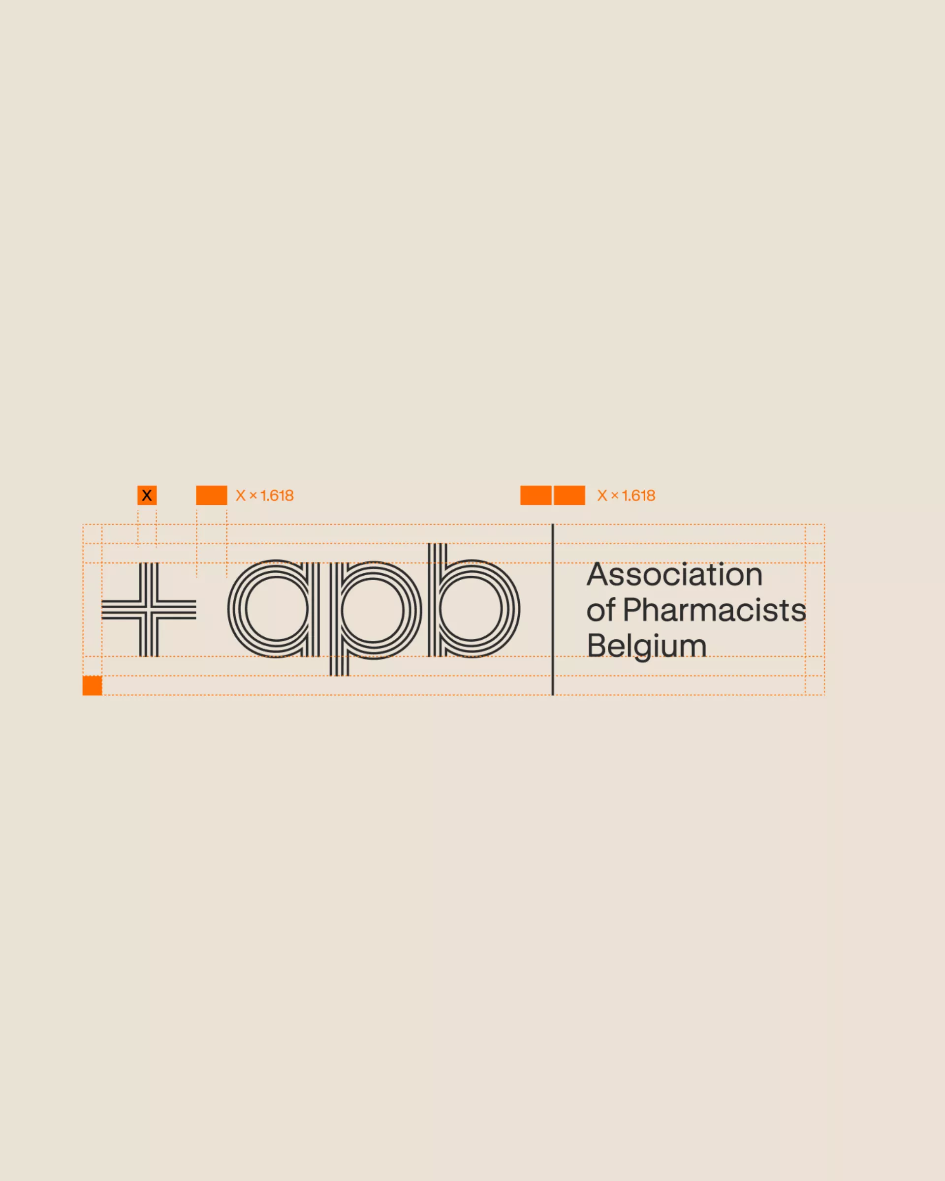
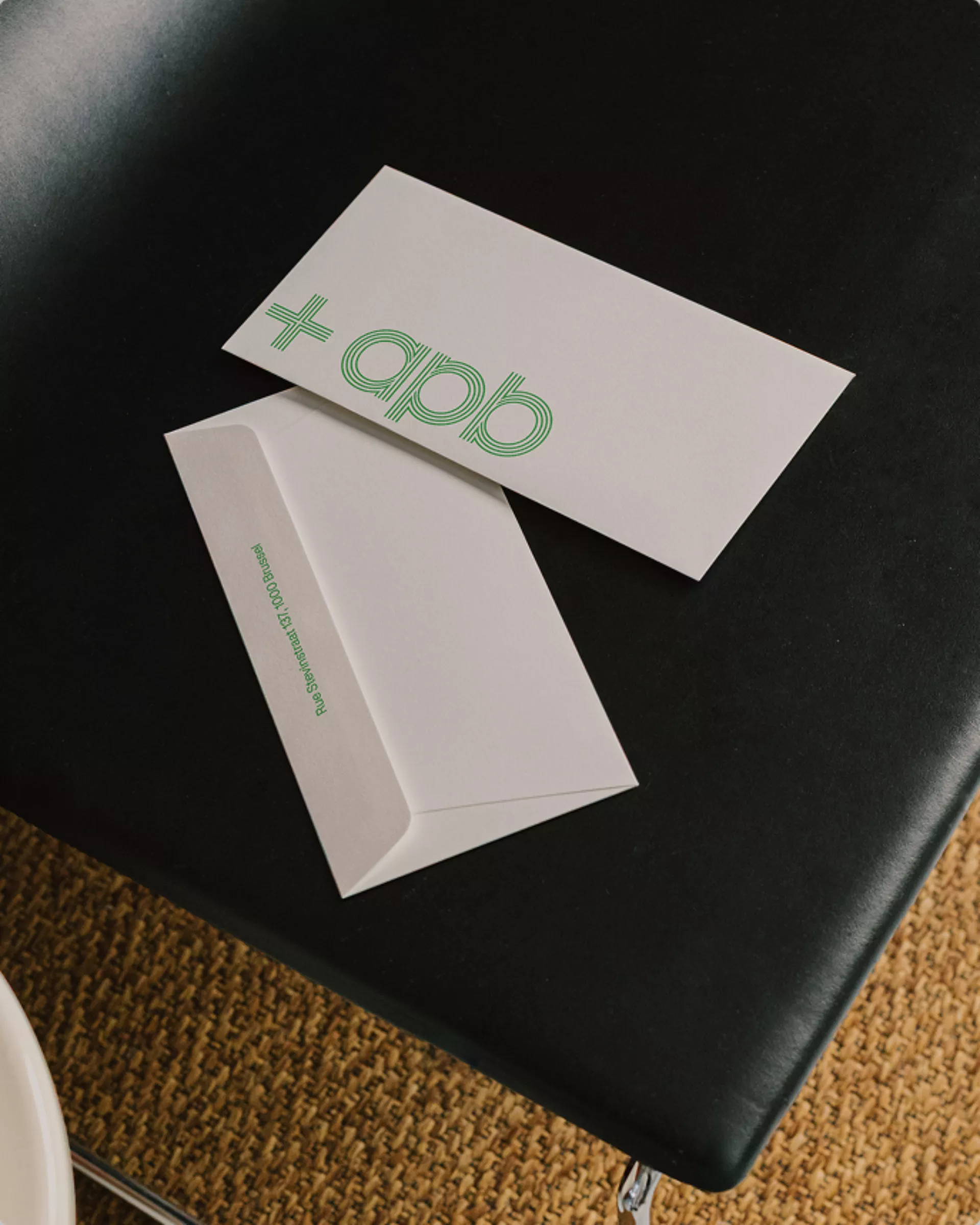
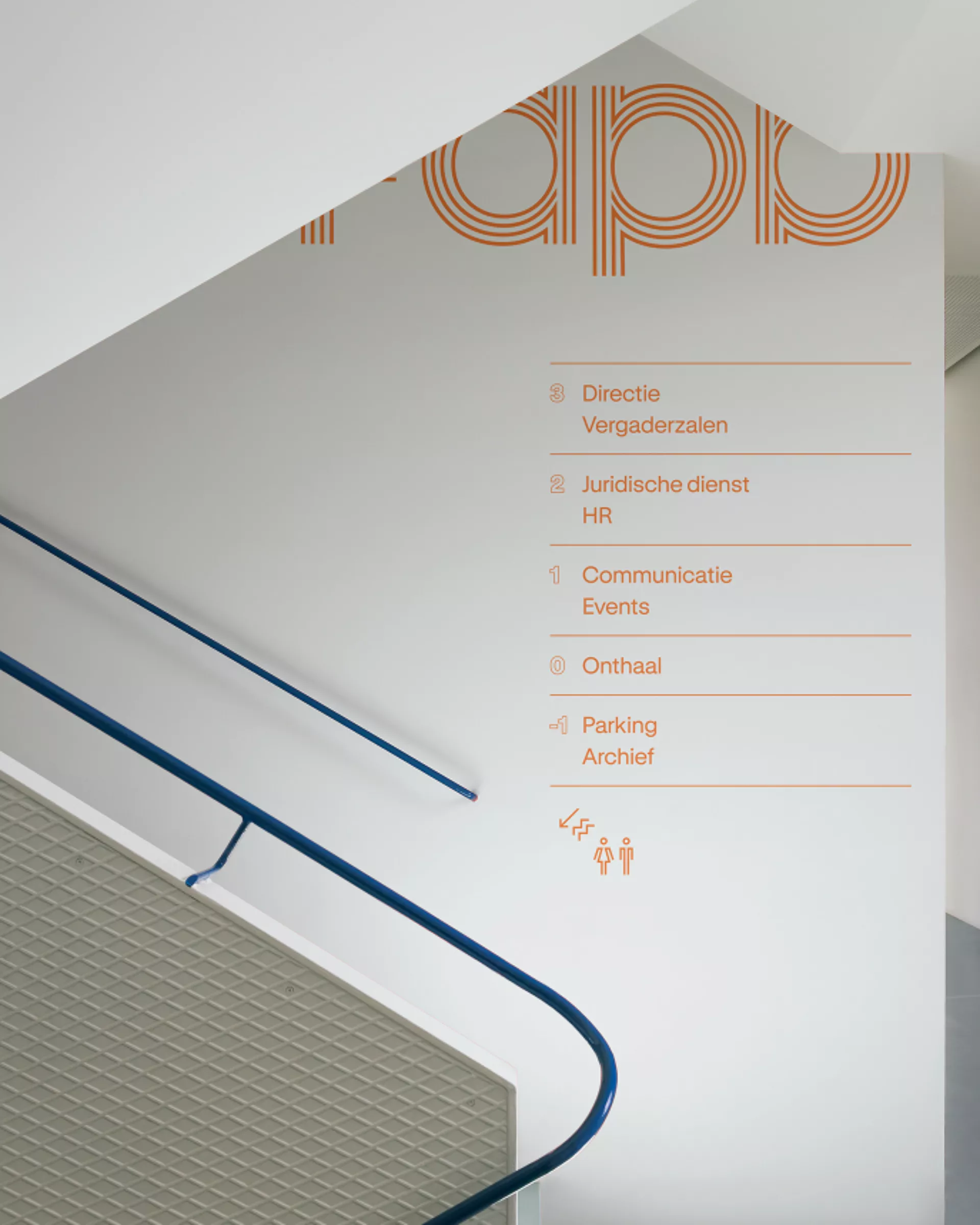
Everyone in Belgium knows it: the green cross glowing above the pharmacy door. A sign that someone is there for you, on every street corner, day and night. For APB, the professional association of Belgian pharmacists, we turned that familiar beacon into the heart of a brand new identity. Because APB is a guiding light too: for pharmacists, so they can keep taking care of everyone else. From that one simple shape, we built an entire visual language that is instantly recognisable and unmistakably pharmacy.
The name got a check-up too. In Dutch, APB stood for Algemene Pharmaceutische Bond. In French, for Association Pharmaceutique Belge. One acronym, two names, plenty of confusion. Now there’s one name for everyone: Association of Pharmacists Belgium. Clear in every language, and with the pharmacist right where they belong: in the name. We sealed it with a tagline that says what the green cross has been saying all along: Empowering pharmacists for a healthy society.
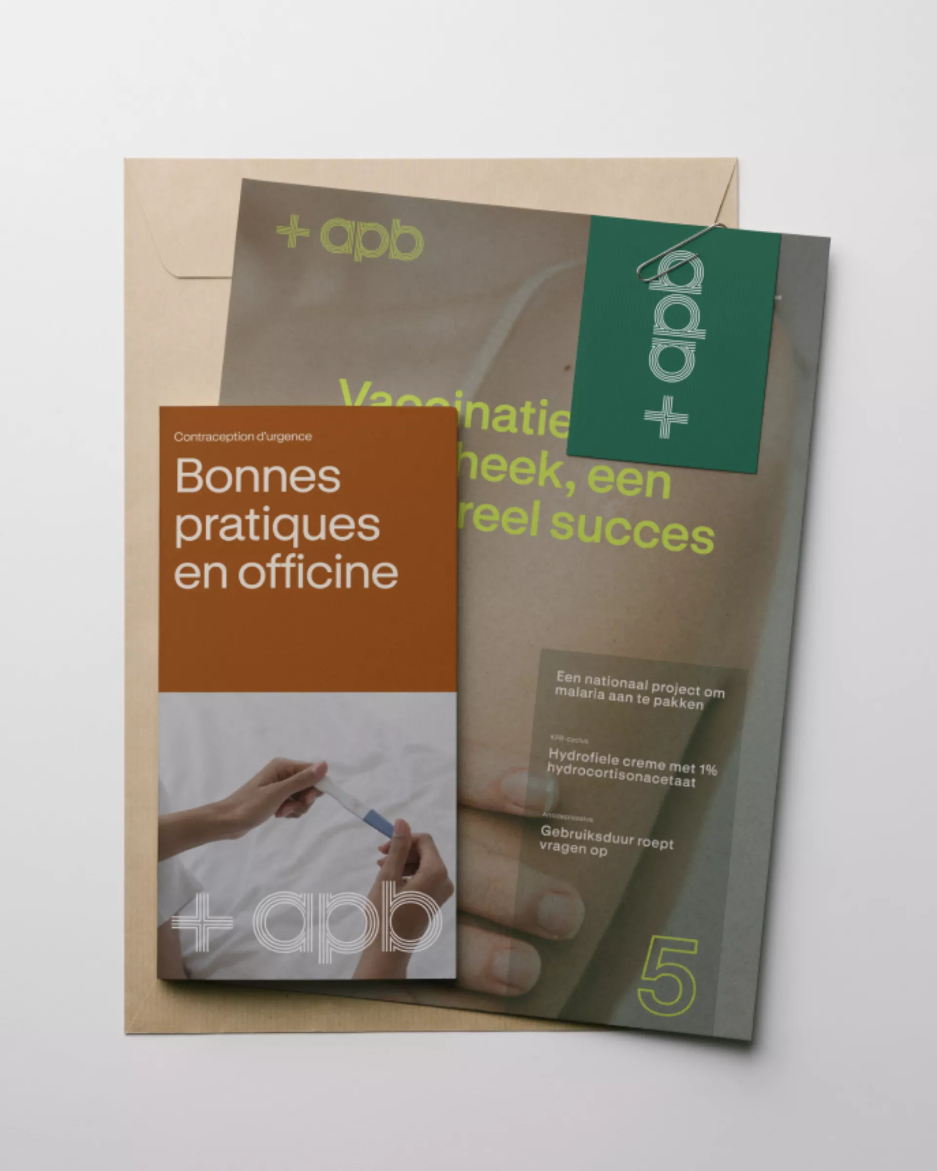
A strong identity is only as good as its daily use. So we didn’t stop at a logo and a brand book. We designed a complete design system that puts APB in the driver’s seat, with templates, components and clear rules that let their own team create campaigns, publications and social posts that look right every single time.
It’s the next chapter in the brand architecture we built together with APB, after giving APB Solutions its new name: Intelacy.